Knowing where to start with your furniture placement can be tricky, especially if you’re face with a large, open-place space, or small and awkward rooms.
Furniture serves many purposes in a home. Of course, the biggest being its functionality – a bed to sleep, a sofa to sit on, a table to eat at – and some pieces serve a different purpose entirely. However, each piece in your home will have an impact on the space from balance and symmetry to scale and form. As with everything in design, the key to creating the perfect space is ensuring that it is both practical and aesthetically pleasing.
But how exactly do you achieve this?
Let’s take a look…

Choose A Focal Point
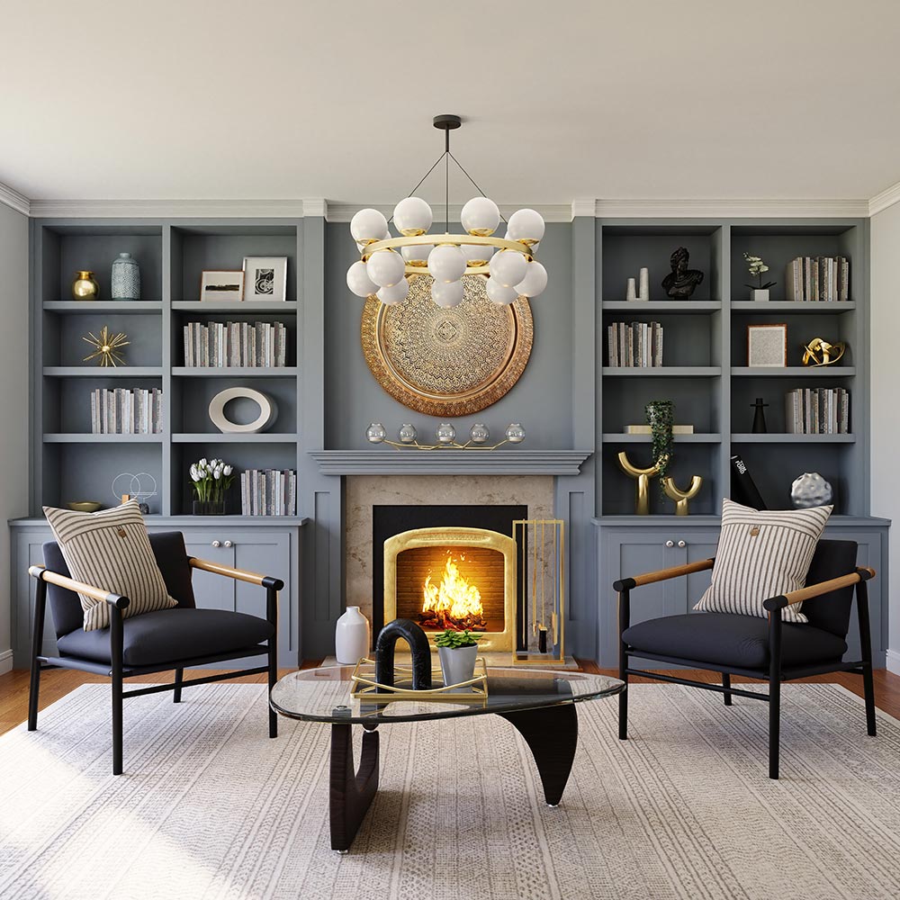
Having a focal point in your design is a great place to start. These can be natural focal points, such as a bay window or fireplace, or they can be something you install yourself. It should be something eye-catching and interesting to look at. If your space doesn’t have its own natural focal point, you can create your own through artwork, feature walls, shelving or a floral arrangement.
If you have an antique or vintage pieces of furniture that you love, these can also be your focal point. Think about where they are best placed for maximum impact. Are they the first thing you see when you walk in a room? Or can you still view them from neighbouring rooms or windows?
‘The Grid’
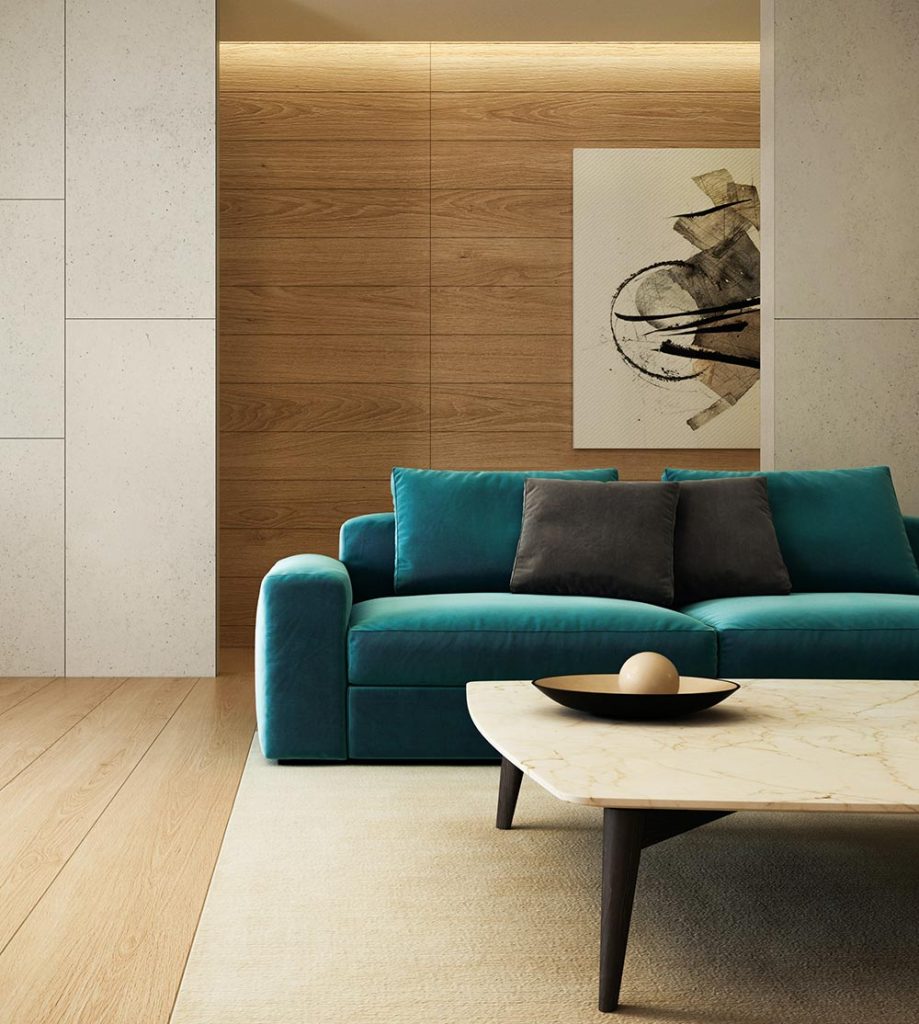
Once you’ve agreed on your focal point, the grid should be at the forefront of your mind. This is all about creating horizontal and vertical lines in your room through key pieces. Tall cabinets and high-backed chairs will reinforce height, whilst sofas, rugs and coffee tables can help to add horizontal lines.
Zoning
Deciding on the zones of your space will have been decided as part of your initial design plan and your furniture and other pieces play a huge part in pulling these zones together. This step is particularly important for larger or open plan rooms. Furniture placement in these spaces can help create the feeling of a separate room, without the physical boundary. However, it is important to note that there must also be enough space for the rooms to flow as one, so avoid overcrowding the space as this will leave it feeling cluttered and chaotic.
Spatial Planning
The best way to visualise the layout for your space is through spatial planning. To do this, use scaled models or representations of your furniture and move them around on the plan. You can do this with computer software, or even by physically marking out the size of your furniture with tape on the floor.
A spatial plan will help you visualise the space and whether furniture will actually fit into the room. This can also provide you with a feel of how well the space will fulfil its purpose. Think about how you want to use the space, and whether the plan you have in mind will help you achieve this or become an unwanted obstruction.
When it comes to bigger projects such as extensions or renovations, creating 2 or 3D elevation plans will help you judge different proportions in relation to each other and can help you avoid costly mistakes in the long run.
Consider Traffic Flow
As well as considering how you want each space to be used, considering how they flow from one room to the next is equally important. The last thing you want is guests tripping over furniture or having to squeeze past a sofa to reach the next room. Allow for a couple of feet between your furniture pieces to create a clear path for people to walk through without difficulty. This also applies to areas such as your sitting room and dining area. Ensure there is enough room for yourself and your guests to sit comfortably and pull out any dining chairs with ease.

Creating Balance
Balance is always important when designing a space and the furniture in it. Consider both the size and placement of your pieces and ensure these are balanced throughout the space. For example, grouping all your larger pieces of furniture in one end of the room can leave it feeling lopsided. The same rule applies to the shapes you’re using. Having a room full of sharp, straight lines can create an uneasy atmosphere that is difficult to relax in. If you have lots of straight lines in your room, you could opt for a round coffee table or mirror to juxtapose this.
Scale
Often in design, bigger is better. A large coffee table that centres your living area is not only practical but also is great for the aesthetics. Equally, a larger dining table allows for more seating whilst also giving you more room to enjoy company whilst seated. The same goes for furnishing items such as rugs. It is best to scale these up so they fit under the furniture and extend past it to fill the room. Smaller rugs can often look a little lost in the space and make it feel off.
Top tip: when it comes to table heights for side tables, they should be approximately the same height as the nearby chairs – or lower if this is not possible. Avoid layouts that force people to move from their seats to reach their food or drinks!
Lighting
As we touched on in this blog post, lighting is one of the most important elements when it comes to interior design. Lighting should be placed at different levels throughout a space through a mix of overhead lighting, floor lamps and table lamps to create a warm and welcoming space.
Getting the placement of these elements right goes back to how you will be using the space. Floor lamps look great in the corner of a room behind an accent chair or sofa, while table lamps of course are perfect for any sideboards, mantels or side tables. Wall lights are another great choice if you’re short on surface or floor space.

Artwork
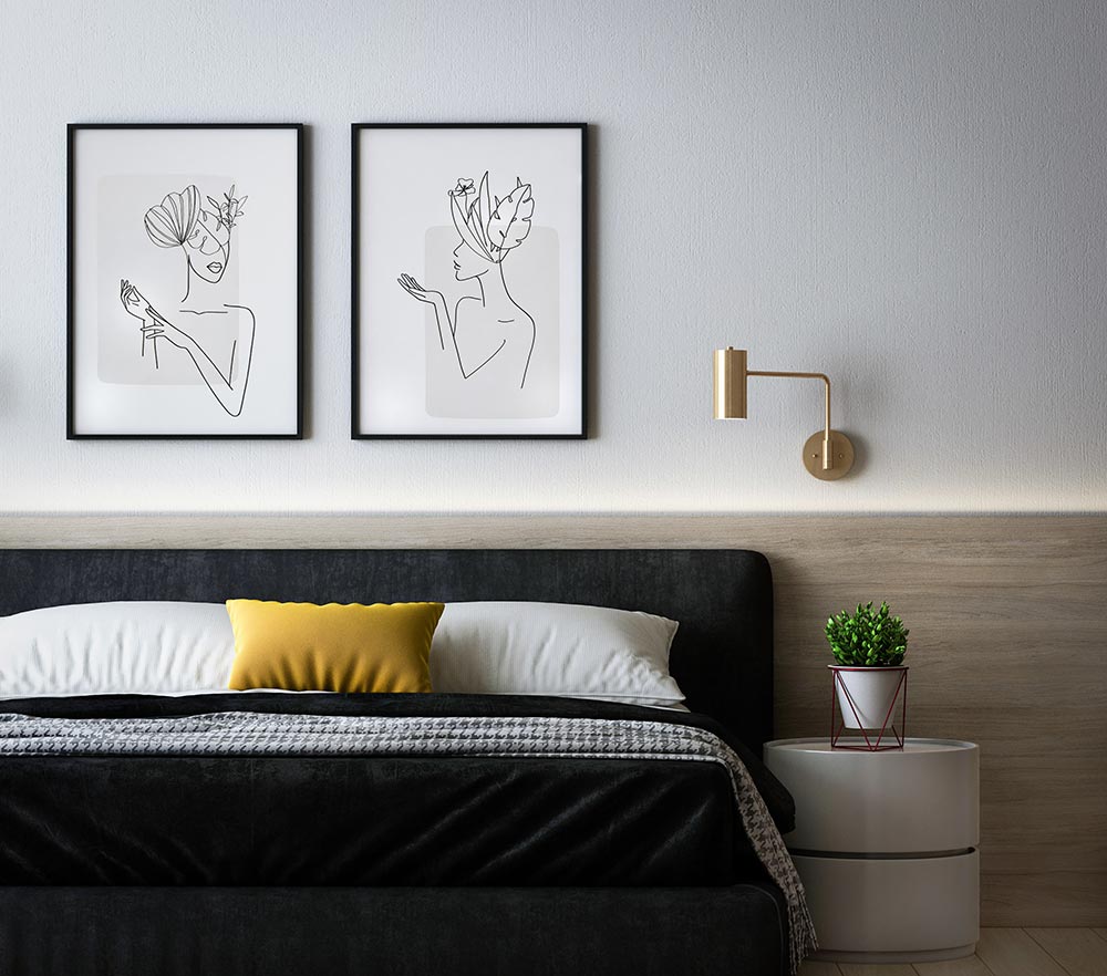
In order to keep your room cohesive and balanced, the placement of any artwork hung on the walls also needs to be well thought-out. This should be in proportion with the room and the furniture used in it. For example, a tiny A4 frame on a large, open wall will look completely out of place. A good rule of thumb for artwork is opting for one large, statement piece; two mid-size pieces; or a group of smaller pieces.
Artwork is another great tool to centre your room and create that all-important focal point, so think about where you want to draw your eye to in a room and use your art as a tool to achieve this.
The Big Picture
There are many things to consider when it comes to furniture placement, however these are all crucial elements that, when used together, will help you create a cohesive and visually pleasing design every time. Think of everything in your room as a piece of the same jigsaw puzzle – when they all come together, they create a finished result!
Follow us on Instagram and Facebook for more tips and inspiration!
If you’re interested to find out how our interior design services could work for you or your business, get in touch today.
